Houzz Tours

Kitchen Tours
Kitchen Tour: Crittall Windows Lift an Open-plan Extension
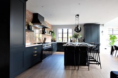
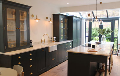
Elegant black units and oodles of light give this space a tranquil feel, but the windows are the real stars

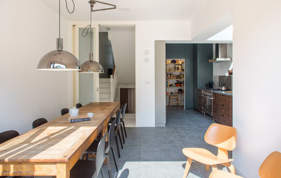
When it comes to a great kitchen, we all know the right cabinets, layout, worktop and flooring are crucial. However, beyond offering light and access to the garden, the impact of window design can get forgotten. Not in this space, though. Striking, black-framed glazing in not one, but three, places adds a bold touch that elevates this open-plan room.
“Originally, the steel windows weren’t part of the plan,” recalls interior designer Rachel Healy of H Interiors. “They’re not something you really see in this part of Nottingham, but the owners and I just fell in love with them. They add an extra layer of detail that really brings this space to life.”
“Originally, the steel windows weren’t part of the plan,” recalls interior designer Rachel Healy of H Interiors. “They’re not something you really see in this part of Nottingham, but the owners and I just fell in love with them. They add an extra layer of detail that really brings this space to life.”
The owner knew from the off she wanted dark, Shaker-style units.
Despite the room’s basic shell being fairly modern – no beams or original period fireplaces here – traditional cabinets, a reclaimed brick wall and, of course, those fantastic, timeless windows add a heritage twist.
“I think the term industrial gets overused, but the steel windows do have an almost industrial feel that works really well with the other fittings,” Rachel says.
The tall cupboard on the right houses the kettle and toaster, while the large island features a wine fridge.
Shaker units, Roundhouse; painted in Off-Black, Farrow & Ball. Masters bar stools, Philippe Starck for Kartell.
Find a great kitchen fitter in your area on Houzz.
The exposed brick wall behind the double range cooker adds natural warmth and, again, brilliantly walks the line between period authenticity, edgy industrial and calming modern style.
The worktop is a hardwearing composite: white with the faintest of grey marbling. The handles are brass, which contrasts beautifully with the black paint.
Rachel and the owners were undecided about a cooker splashback. “We looked at loads of photos and many people just leave it bare,” she says. “But that isn’t practical if you do a lot of cooking, especially as bricks are porous. In the end, we chose glass, which works perfectly.”
At first glance, the floor might resemble wood, but it’s actually ceramic tiles: oak style with a grey wash and grey grout. “We chose extra-wide ‘planks’, as this is a large room and they don’t break things up too much,” Rachel says.
“Tiles made sense, as the owners have underfloor heating. In their last place, they found engineered wood expanded, while high heels left marks,” she adds. “Now they don’t have those problems. It’s super-practical.” Plus tiles are a no-brainer if you’re seeking a floor that’s easy to mop, and the family have a dog.
Open shelving breaks up the brick expanse, and provides a home for accessories. “It’s quite a big area and we knew we didn’t want wall cabinets,” Rachel explains.
Ceramic floor tiles, East Midlands Ceramics. Kitchen cupboard handles, Buster & Punch.
The super-high, arched window, designed by the architect, gives an almost church-like feel to the dining area.
The refectory-style table was made bespoke by a local joiner and is extra-long – great for big dinner parties or family lunches. It’s not too narrow, either. “Too many off-the-peg designs aren’t wide enough, and can end up like boardroom tables,” Rachel says.
Black dining chairs, Muuto. Eames Wire Bikini chairs, Vitra.
The owners decided to keep the dining space pared back, sticking to table, chairs and one rather impressive potted plant.
This area is flooded with light thanks to the lofty skylight. Industrial-style lighting keeps the look modern and fits with the steel-framed windows.
This area is flooded with light thanks to the lofty skylight. Industrial-style lighting keeps the look modern and fits with the steel-framed windows.
An oversized clock adds the perfect finishing accent – again industrial, with strong, dark looks. “It’s really big, about 60cm diameter, but this room can take it,” Rachel says.
Clock, Newgate.
Clock, Newgate.
When it came to planning a layout, the team knew pretty much straight away where the kitchen and dining areas would slot in, but the living zone was trickier. “We played around with different configurations. People always imagine mapping out a small room is harder, but actually big spaces can be worse, as there are so many possibilities,” Rachel says.
“We positioned the sofas in the darkest, cosiest section of the room and the kitchen and dining areas nearer the large external doors and windows,” she explains. “That area also benefited from a long wall against which we could run our kitchen units, so it all fell into place quite easily.”
Blue sofa, BoConcept. Floral fabric on cushions, House of Hackney.
The TV corner is where the kids can crash and chill out. The internal window brings some borrowed light into this darker area.
A modern wood-burning stove keeps the room cosy in winter. In fact, Rachel says, given its generous proportions, overall it’s a surprisingly cosy space. “I think this is quite a calm room,” she says.
Classic steel-framed windows don’t just make a stylish exterior detail. These internal windows add a broken-plan element that keeps the ground floor feeling open. The doors here lead through to the hallway.
“The window means that, when you come through the front door, you get a view through the whole house, which is quite magic,” Rachel says.
“The window means that, when you come through the front door, you get a view through the whole house, which is quite magic,” Rachel says.
The family spend a lot of time at the breakfast bar – it’s where they eat most meals, with the dining area reserved for special occasions. “In their last home, they had a big breakfast bar, which they used a lot,” Rachel says, so they knew a big island would work well here, too.
Tell us…
What do you like about this open-plan kitchen? Share your thoughts in the Comments section.
Tell us…
What do you like about this open-plan kitchen? Share your thoughts in the Comments section.

Sponsored
Sponsored
Who lives here? A family with three school-age children
Location A suburb of Nottingham
Property A detached Edwardian house with five bedrooms and five en suite bathrooms
Designer H Interiors
Architect Longworth Associates
The owners moved from a semi-detached house to this detached property on a bigger plot, drawn by the scope for expanding.
“This was a big conversion project,” Rachel says. “The house was gutted, as it wasn’t really liveable or suitable for a young family.”
The facelift included knocking down an existing conservatory and building a two-storey extension. On the ground floor, this meant space for an airy kitchen-diner plus a utility room and cloakroom.
Designer Rachel came on board early. “This was a really collaborative project between myself, the owners, the architects and the builders,” she says. “I’d worked with the owner before, so knew what she did and didn’t like. She was fond of light, and wanted something quirky with a few unusual design features.”