Decorating
Ways to Work with Denim Drift – Dulux Colour of the Year 2017
Check out ideas for using this calming grey-blue hue in every room of your house

Last week, Dulux announced its Colour of the Year 2017, and it’s no surprise that the winning hue is a shade of blue, a trend we’ve spotted a lot already on Houzz this year. Denim Drift is a soft, versatile blue – based on the sort of denim you might see on a sun-faded pair of vintage jeans, rather than the stronger indigo of new denim.
Denim Drift – Dulux Colour of the Year 2017.
Blend your blues
Blue on blue is also cropping up across Houzz a lot, and this year, the paint brand’s leading shade is part of a quartet of 2017 trend palettes, the first of which is a collection of 10 blues ranging from muted to brighter tones, and all designed to complement each other.
The other three palettes feature, individually, 10 red-tinged hues, 10 green-based ones and 10 earthy shades of browny pinks and greens. All fall into the overriding theme of celebrating the simpler things in life and getting back to nature.
Seen here are the nine other blues chosen to complement the grey-tinged winning colour, pictured one up from the bottom in the middle row.
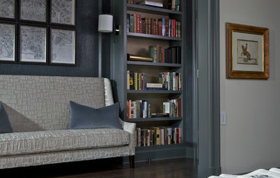
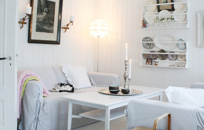
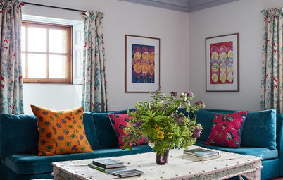
Cosy up with red
This inviting corner features several very similar grey-blues. Layering colours and textures – here including that oh-so-strokable velvet – creates a very cosy atmosphere and shows how surprisingly warm this traditionally cool colour can feel.
Again, this palette hops across the colour wheel to include strong, earthy tones of red, in the cup and lampshade. Note how the sofa, with its blue teetering on the brink of purple (which is, of course, red + blue), ties the whole look together.
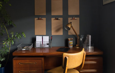
Add depth
Make grey-blue your backdrop, but warm it up and add interest and depth by mixing a variety of darker blues into your scheme.
This nook feels snug and inviting thanks to the indigo accents dotted around the room, especially on that bottom bunk. See how different the top bunk looks, with its concentration on a paler palette lending it, instead, a cooler and airier feel.
See more blue bedrooms under the Photos tab
Create a cool welcome
Again, this shade shows how wonderfully it works when combined with warm, earthy tones.
It’s a good choice for a front door if you want a cool-toned foil for very warm, red bricks, like the ones on this house; they wouldn’t work as easily with hot colours, such as pink or red, which could clash.
Again, this shade shows how wonderfully it works when combined with warm, earthy tones.
It’s a good choice for a front door if you want a cool-toned foil for very warm, red bricks, like the ones on this house; they wouldn’t work as easily with hot colours, such as pink or red, which could clash.
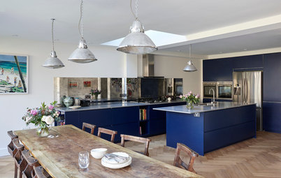
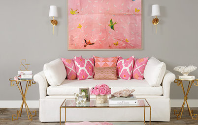
Start with your sofa
A deep, squishy sofa is the perfect vehicle for making this chilled-out shade your focal point. Mix it with pinks for a trad, ice-cream pastels take on the colour. Zinc and silver tones in the table, mirror and vases keep the space feeling cool and calm.
This blue-grey hue is very versatile, though, and if you fancied a change, you could easily warm things up and surround your pale blue sofa with nature-inspired accents by simply switching the rosy accessories for jungly green leaves placed in an emerald glass bottle, pale green velvet cushions, an earthy brown or tan blanket or throw, and soft gold or brass details.
Chuck in a wooden-framed, vintage-style specimen chart for the wall – butterflies would work well – that collects the whole palette together, and your transformation is complete.
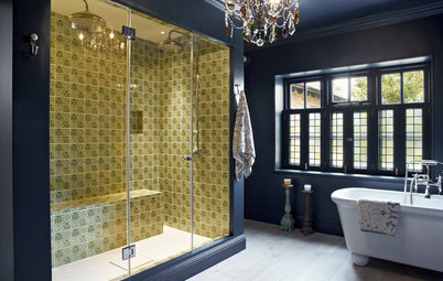
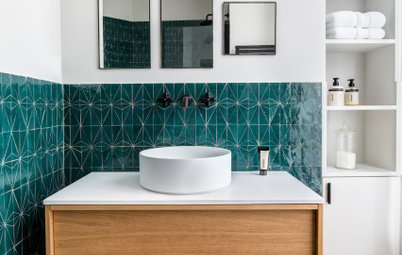
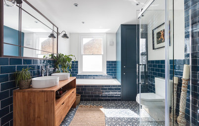
Soften your blue bathroom
Blue and white bathrooms can look crisp and nautical – lovely, if that’s the look you’re going for. But if a gentler environment for your ablutions appeals, then try this shade as an accent tile, as seen in this space, with its half-wall of denim-y metro tiles.
Black is a great colour to ground a scheme and continue to steer things away from a more seaside-like effect. Texture and pattern can further break up the sharpness of a blue and white bathroom: here, the fireplace has been left with rough rust patches showing through, while floor tiles that combine all three core colours in a small pattern contrast well with the brick formation of the wall tiles.
As a quick-fix or lower-budget alternative, reclaimed wooden details, vintage, cast-iron shelf brackets and a basin splashback made from just a couple of second-hand blue-grey-white encaustic tiles would also help you to achieve the feel of this bathroom.
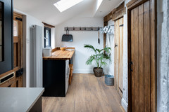
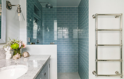
Freshen up
This open-plan space, like the bathroom in the previous photo, also mixes its faded denim hero with white, but shows how different the combination can be with just a few tweaks.
Here, the feel is very much a fresh, seaside-y one, thanks to the addition of a strong cerulean shade in the patterned cushions, vase and book. The wooden coffee table and dining chairs – in the sort of smooth, teak-like finish you’d find in a classic boat interior – back up the mood, while light-reflecting gloss white units bounce that sunshine around.
Use it to accessorise
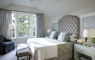
Decorating isn’t the only way to add this shade to your scheme. Here, layers of blue-greys on the bed give this space a comforting, soft feel.
Mix up textures to keep things feeling informal and choose linens, and even denim fabrics, for cushions to tap into that relaxed feeling you get from pulling on your favourite pair of jeans on a lazy Sunday. To bump this room from breezy and summery to something cosier for winter, dot in some deeper blues.
What do you think of this on-trend colour? Let us know how you’d use it in your home in the Comments below.


Sponsored
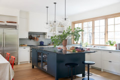
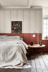
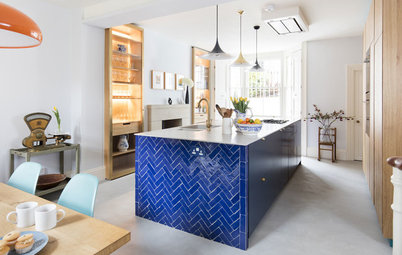
Here, the grey-blue shade is paired with a deeper, stronger hue and used to create a two-tone wall. Traditionally, in Victorian homes with dado rails, darker colours would fall below the rail, with lighter shades above. This idea mimics that convention, but uses it to create a pared-back, modern-rustic scheme.
Blues partner perfectly with warm, earthy colours; here, the complementary shades are all soft browns, as in the timber ceiling, pale encaustic floor tiles and wooden table and benches.
Read more about the trend for blue kitchens