5 Ideas for Kitchen Extension Layouts in Victorian Homes
Embarking on a rear extension project? Need layout ideas? Look no further...

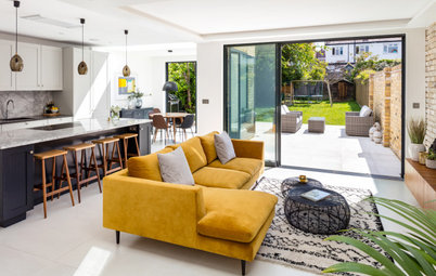
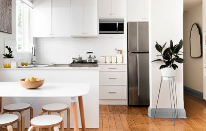
Take five Victorian terraced houses with rear extensions, five different architects and interior designers, and what do you get? Five very different layouts. If you thought adding more space to your kitchen was about putting a box on the back of your house and jigging the kitchen around a bit, let this selection of projects from our tours expand your thinking and inspire ideas for your own home.
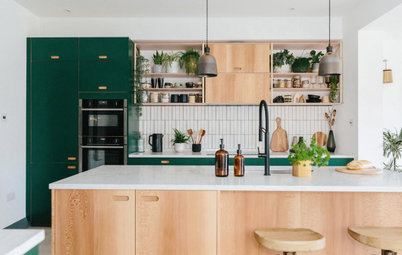
In the rest of the space, the architects stuck to a simple yet workable layout, with a bank of base units running along the opposite wall to the tall cupboards, a sink station at the back, and a 400mm x 1900mm island in the middle, which houses a wine fridge and a breakfast bar.
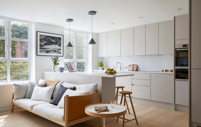
Explore more of this light, open-plan space.
Explore more of this light, open-plan space.
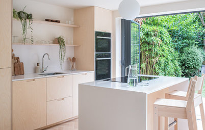
2. Turn the stairs
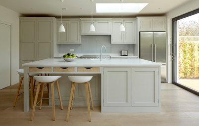
This long stretch of kitchen exists due to a major reconfiguration at the front of this early Victorian terraced house. Architect Lizzie Fraher of Fraher & Findlay turned the staircase so it cuts across the house rather than along it.
She then flipped the common seating-at-the-garden-end idea and instead created a cosy lounging nook in the space newly opening up by turning the stairs, just seen at the back in this photo.
Make the challenge of finding the right people for your project easier by searching the Houzz Professionals Directory.
At the back, the extension has been built on an angle. “We wanted to extend in order to increase the kitchen space at this lower ground floor level,” says Lizzie, “but planning made us fold back the design so it didn’t impose on the neighbours’ extension.”
Part of the extension is two-storey (see the large black-framed window close to the main house), creating a dramatic, double-height space inside.
Part of the extension is two-storey (see the large black-framed window close to the main house), creating a dramatic, double-height space inside.
Inside, an up and over rooflight stretches the space and draws the outside in. The angled door pivots open. Bench seating on one side of the dining table maxes the available space in this skinny part of the new room.
The space is carefully designed to be purposeful, with everything bespoke. “Because nothing is challenging the space, it feels bigger,” Lizzie says.
Kitchen units run floor-to-ceiling on the other side of the island, just out of sight here, while the island neatly contains the sink, an integrated dishwasher and a wine fridge.
See the whole of this revived home.
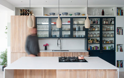
3. Echo an existing shape
Rather than extend to the same depth across the full width of this house, architect Mike Tuck worked with some of the original layout. If you look at the house next door, you can see something close to what was here previously. “It’s a common layout for the houses in this area,” Mike says.
The part of the extension that sticks out is where the original bathroom had been and where the utility room is now.
The dining area is in the extension, with the section of wall behind the table showing where the back of the original house was. Mike put in a steel frame to support and open up the new space.
The aforementioned new utility is tucked around the corner, off the kitchen, which is in the darkest part of the space. It’s a step up from the extension because the patio is lower. Mike explains there were two options with the step – to have one here, or to put one at the threshold between the dining area and the garden. Mike and the owners opted to create a flush line onto the decked patio.
Learn more about how this home was transformed to boost space and light.
4. Work in a window seat
This home gained a wider space thanks to a side return extension, but rather than going for glazing right across the back, Ellen Cumber and Alice Bettington of Golden Design suggested Crittall doors and an oriel window, along with a row of rooflights above the new space.
“We try to steer clients away from glass right across the back, as it can be very limiting,” Ellen says. “With the amount of glazing we were already putting into the project, they didn’t need extra light, plus we also had in mind that we wanted to do the window seat.”
At the back of the kitchen, the stepped threshold that would originally have led from the back reception room into the external side return remains, but is of course now indoors and has been clad in the same flooring as the kitchen.
The door to the left of the fridge leads down to a small utility room, which was really helpful when it came to fitting in maximum storage. “There’s an original cellar down there,” Ellen says. “The ceiling is low – around 1.8m – but there’s a utility room, so we were able to get the washer and dryer out of the kitchen.”
Discover how this kitchen was designed for two keen cooks.
5. Move internal walls
This extension had already been built when interior designer Gemma Fabbri got her brief to reconfigure the fairly modest space.
The couple had a tight budget and asked if it was possible to use the existing extension, so Gemma designed a solution with that in mind. She knocked down the old external wall, which was still dividing the extension from the rest of the house, and found a better location for the cloakroom, which had previously been at the garden end of the space.
“I did a number of plans and came up with opening the kitchen completely to the extension [including removing the cloakroom] and moving the wall that ran alongside the staircase slightly further into the kitchen space,” Gemma says.
“This created a corridor so we could access under the stairs, where we fitted a utility/cloakroom, which houses the washing machine,” she says. “Although this made the kitchen slightly shorter, the fact we’d opened it up made for a far more flexible space.”
“This created a corridor so we could access under the stairs, where we fitted a utility/cloakroom, which houses the washing machine,” she says. “Although this made the kitchen slightly shorter, the fact we’d opened it up made for a far more flexible space.”
The corridor runs directly behind the splashback at the back of the room, and is accessed from the other side of the door.
Read how the poor extension was brilliantly reinvented and see ‘before’ photos.
Tell us…
Which of these designs would you most like to live with? Let us know in the Comments.
Read how the poor extension was brilliantly reinvented and see ‘before’ photos.
Tell us…
Which of these designs would you most like to live with? Let us know in the Comments.

Sponsored
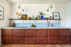
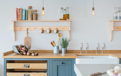
This characterful kitchen was extended by 13 sq m – mainly to the side. In this area, a newly installed series of skylights, supplemented by a row of industrial-style wall lamps, allows light into the once-dark room.
The side return extension is the perfect zone for a seamless bank of push-to-open, full-height cupboards. It was designed by John Norman of Mustard Architects, who added tall, tongue-and-groove doors as a stylish yet unobtrusive way to disguise masses of storage space for crockery and a full-height larder unit.