
Houzz Tour: A Stylish Flat with a Rooftop Sunroom and Terrace
This couple love to entertain, but plan to grow their family. With its penthouse sunroom, this home is perfect for both

This active couple in their thirties were looking to settle down – and start a family – in a large flat. When they discovered this two-bed duplex, which comes with a 970 sq ft (90 sq m) terrace that overlooks all of Boulogne-Billancourt, France, it was love at first sight.
Though the flat was quite shabby, the couple immediately saw the huge potential of the space and fell head over heels for the stunning sunroom and surrounding rooftop patio that make up the duplex’s second level. It’s the perfect place to entertain friends and let loose without worrying about neighbours and noise levels.
Though the flat was quite shabby, the couple immediately saw the huge potential of the space and fell head over heels for the stunning sunroom and surrounding rooftop patio that make up the duplex’s second level. It’s the perfect place to entertain friends and let loose without worrying about neighbours and noise levels.
The layout of the lower level is pictured here. It features a large living area, two bedrooms, a cloakroom and a bathroom.
The only change made to the partitioning of the spaces during the renovation was that the kitchen was opened up towards the living room.
Find an interior designer in your area in the Houzz Directory
The only change made to the partitioning of the spaces during the renovation was that the kitchen was opened up towards the living room.
Find an interior designer in your area in the Houzz Directory
Before The entrance originally opened to this wooden bookcase, which had stood on poor-quality laminate flooring. The dark floor and the grey unit gave the entrance a dismal feel and weren’t really what the owners wanted.
After The owners work hard and also love entertaining. They thought of their flat as a refuge and wanted it to feel like a holiday home. Together with their interior designer, they incorporated a bohemian-chic style defined by a relaxing and simple feel, bright colours, natural materials and greenery, all balanced against clean, modern lines.
These two main décor themes – clean lines and boho chic – are represented right at the entrance. The shelving unit’s horizontal lines and staggered vertical elements are juxtaposed against rattan lamps and mirrors. None of the bookcase shelves or boxes are the same length or height, a detail that spoke right to the owners’ artistic hearts.
The flat is located on the 9th and 10th floors and faces southwest and northeast, with no buildings to interrupt the view, so it was already a bright space. Breton took this as a challenge to make it brighter still.
“It was interesting to play with ways of adding more light,” Breton says. “I staged the space with a dark-blue entrance to enhance the contrast. Once you pass through this dark area, it’s always amazing to enter the brightness of the large living room, even on a grey day like today.”
Here we see the true colour of the hall – a midnight blue that’s darker and more matt than it looks in the previous pictures. This small window peeks into the kitchen – it was cleverly adapted from what used to be a doorway.
Walls painted in Capsule, Tollens.
Browse a huge range of modern paints in the Houzz Shop
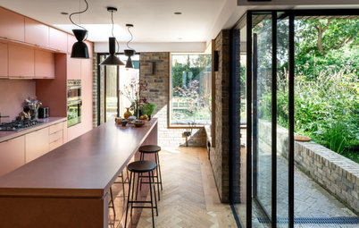
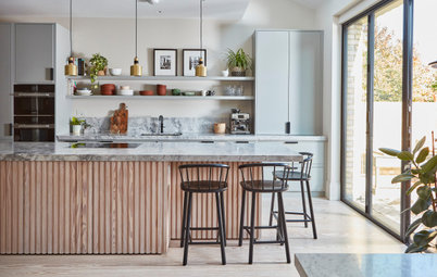
Before The kitchen is adjacent to the living-dining room. It used to be closed off and impractical: there was only enough space for two people to share a meal, which is oddly restricted for a flat this size. Fortunately, it was easy to connect the kitchen to the living room.
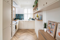
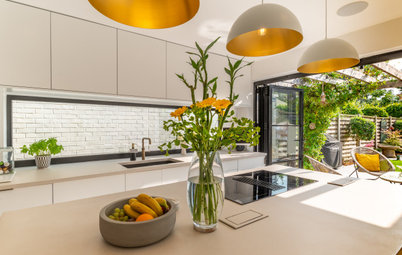
After This is what the new kitchen looks like. To the right of the fridge-freezer is the small window to the hallway, which we’ve already seen from the other side.
Breton decided to go with a pale grey kitchen to match the new, very raw, almost industrial oak floor chosen by one of the owners.
“[The owner] was involved in all the choices and we had real exchanges that were very enriching during each phase of the project,” Breton says. The owner also chose the industrial pendant lights and the bar stools for the kitchen.
Before The original galley kitchen felt like a hallway and was cut off from the rest of the house.
After The new kitchen features a 4.5m row of units. To keep costs down, Breton went for Ikea cabinets, but supplemented them with a worktop and island made by a carpenter out of water-repellent pressed wood. Decorator Anne-Sophie Cravino was brought in to cover them in waxed concrete produced by Mercadier.
“I designed the kitchen starting with the Ikea modules,” Breton says. “I arranged it in such a way that the horizontal and vertical lines would create a calming, unified effect.
“The cabinets are flush with the ceiling and the vertical lines of the cabinet doors above and below are aligned perfectly. When your eye stops on these well-defined lines, nothing can distract you, and this creates a deep sense of calm.”
The large amount of built-in storage future-proofs the space. “It was important not to work for the short term alone. We made sure they have space for all their appliances and also incorporated many drawers on the left, because that will be very handy, especially with children,” Breton says.
The owners fell in love with these cement tiles, which give the kitchen lots of personality. It’s the touch of bohemian chic that compensates for the straight lines in the rest of the space.
Cement tiles, Mosaic del Sur.
Cement tiles, Mosaic del Sur.
Before When Breton and the owners first saw the living room, paint had been peeling off parts of the ceiling.
“It would have been impossible to apply new paint directly over the old layer. This is what caused the most trouble in the whole renovation.
“After a survey was conducted [by a specialised agency], we discovered that the positioning of the sunroom over this space created a thermal bridge, and alternating heat and cold produced humidity, which had caused the paint to peel off. So we insulated the existing ceiling and put in a dropped ceiling that could be painted,” Breton says.
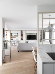
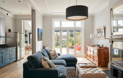
After The owners wanted the living room to be a simple and functional space with bold features. “We kept the furniture simple, but added bright colours and a few graphic design elements to give it some character,” Breton says.
Before The former owner had used this room as a TV lounge.
After Since the owners wanted to make the sunroom their living room, they decided to turn the heart of the flat into a large, unique living space. They chose a sofa with the simplest possible shape, while the central part of the room is reserved for the dining table.
The furniture was carefully selected for its natural materials – rattan and oak – with simple shapes in the spirit of garden furniture.
“I agree with their choice of this natural style, because I’d spent all my holidays as a child in a rustic house in Corsica, so this idea of simplicity is etched into me,” Breton says.
Rocking chair, AM.PM. Tripod floor lamp, 3 Suisses. Black lamp, Broste Copenhagen.
The room has been planned around a number of defining lines, like a page layout. So, there’s no tall furniture between the kitchen and the sofa that would interfere with its vanishing lines. Also, a shelving unit runs along the wall on the right, visually lengthening the room while echoing the vertical lines of the kitchen.
In anticipation of children and the future need for an extra bedroom, this low bookcase is made of three modules. The central one can be removed to make room for a partitioning wall.
The bookcase is reminiscent of the shelving unit at the entrance: blue and white, boxes of different sizes for the sake of aesthetics, closed storage modules and open sections to display decorative objects.
It also serves as a pedestal for the owners’ cactus collection, as the pair love greenery.
It also serves as a pedestal for the owners’ cactus collection, as the pair love greenery.
To add an element of surprise, the owners opted for a charpoy –an Indian bench seat – instead of a standard sofa. It is covered in cushions for comfort.
“We wanted to get a bit of a bohemian touch on both sides of the room. This charpoy picks up on the idea of the splashback in the kitchen,” Breton says.
“We wanted to get a bit of a bohemian touch on both sides of the room. This charpoy picks up on the idea of the splashback in the kitchen,” Breton says.
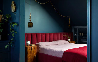
Before Here is the master bedroom in its original condition.
Before The closet, with its mirrored doors, was originally at the entrance to the room.
After The closet was moved and painted a midnight blue to echo the hallway.
After At the owners’ request, what was once the closet has now been turned into a shower.
The owner chose this location for the shower because he wanted to draw natural light into the bathroom behind it.
Its inside is finished with zellige tiles – Moroccan handmade, enamelled terracotta tiles fired in traditional wood-burning ovens. “We chose this model because it has more visible imperfections than those from other suppliers, creating a real air of authenticity,” Breton says.
Tiles, Ateliers Zelij.
Tiles, Ateliers Zelij.
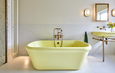
The bathroom was designed with the future additions to the family in mind: the pair chose to include a bath for their children.
The bathroom was adorned with cement tiles that recall both the kitchen and the blue theme. The floor tiles are fragile and had to be additionally protected against damp. However, this was a deliberate choice.
“We didn’t like the hard look of porcelain stoneware and wanted a natural material that would age over time,” Breton says.
Before The original cloakroom, just like the rest of the flat, was not to the owners’ taste.
After To give it a much-needed facelift, the standard toilet was replaced with a wall-hung design. The 1960s-style mosaics were replaced with more contemporary cement tiles, and a dark grey accent wall adds a bit of a dynamic touch.
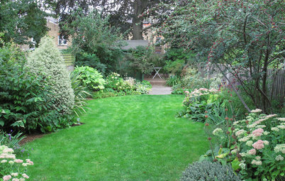
It was the second level of their duplex – a rarity in Boulogne-Billancourt – that sold the couple on this home. On the10th floor of the building and with a completely unobstructed view of the city, the 325 sq ft (30 sq m) ‘penthouse’ sunroom is surrounded by a 970 sq ft terrace.
The wooden staircase that leads from the entrance to the second level was completely redone in a contemporary style, with a metal structure and wooden steps painted grey.
The wooden staircase that leads from the entrance to the second level was completely redone in a contemporary style, with a metal structure and wooden steps painted grey.
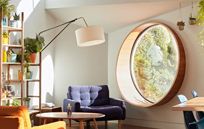
Before The former owner had converted the sunroom into an office and living room.
After The couple knew straight away that they wanted to turn this space into a living room for entertaining guests and throwing parties all year round. Up here, they can turn the music up without bothering any neighbours.
They asked Breton to design a bar with a holiday feel, to replace the dated library that was here before.
They asked Breton to design a bar with a holiday feel, to replace the dated library that was here before.
Before The sunroom has glazing on three sides.
After The original structure, with its double glazing and polycarbonate roof, was kept as is, but the 1970s flamed-tile floor was covered with waxed concrete.
Before The original fireplace was also very outdated. “As lighting fires in fireplaces is still permitted in the capital, the owners wanted to keep it and give it a makeover,” Breton says.
After Covered with Placo plasterboard and extended with brick benches on both sides, it’s now more up to date. “The bench at the back of the room allowed us to hide two electric radiators, which replace the large one that was originally to the right of the fireplace, disfiguring the wall,” Breton says.
With a comfortable corner sofa and white curtains, the living room looks like that of a Mediterranean house. The owners really like that it offers a change of scenery, and they do their best to make sure their friends get the most out of it.
Tell us…
What do you think of this transformation? Share your thoughts in the Comments section
Tell us…
What do you think of this transformation? Share your thoughts in the Comments section


Sponsored
Who lives here A busy and dynamic couple in their thirties
Location Boulogne-Billancourt, a commune in the western suburbs of Paris, France
Size About 1,345 sq ft (125 sq m): about 1,025 sq ft (95 sq m) on the 9th floor and about 325 sq ft (30 sq m) on the 10th floor, as well as a 970 sq ft (90 sq m) terrace
Budget About £88,330 (€100,000), plus about £13,250 (€15,000) for the furniture
Duration of work Five months
Work completed December 2017
Interior designer Juliette Breton
Photos by Meero
The owners decided the flat needed renovating, but weren’t sure what kind of layout to go for or what colours and materials to choose. Plus, since they were very busy with work, they also needed someone to oversee the months-long project.
As luck would have it, Juliette Breton, a former professional contact of one of the owners, called them to catch up. She had just founded her own interior design firm and was ready to help them out. After five months of work, the transformation more than lived up to their expectations.