


Houzz Tour: Bringing Period Charm Back to a Victorian Terrace
Celebrating the original features of this period property while revising the layout made it both elegant and practical

Many of us are fans of Victorian homes, but that doesn’t mean we want to live with an original layout. Formal, separate spaces and remote washrooms are out of favour, and sociable kitchen-diners and conveniently located bathrooms are in.
And so it was for the owner of this property. While she loved the period features in her new house, she was prepared to revamp the layout to get a home that fitted her lifestyle.
And so it was for the owner of this property. While she loved the period features in her new house, she was prepared to revamp the layout to get a home that fitted her lifestyle.
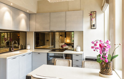
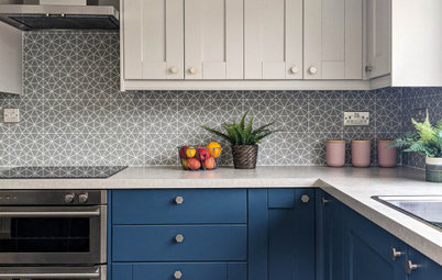
The designers chose a light-reflecting mirrored splashback, as there are no windows in this area of the room
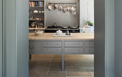
Underfloor heating keeps the kitchen-diner warm, and engineered wood was considered for the flooring. In the end, though, parquet-lookalike porcelain tiles were laid. “The owner has a dog, so it was important to have robust flooring,” Matt says.
Underfloor heating keeps the kitchen-diner warm, and engineered wood was considered for the flooring. In the end, though, parquet-lookalike porcelain tiles were laid. “The owner has a dog, so it was important to have robust flooring,” Matt says.
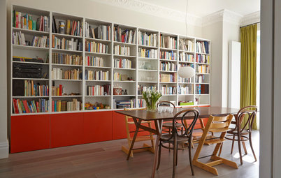
The shape of the kitchen lent itself to an island, but it was a must-have in any case. “One of the key requirements was an island for seating, casual dining, and socialising while cooking,” Matt says.
There’s space in the island for cookbooks, adding a splash of brighter colour to the room.
Find out what you should consider when planning a kitchen island.
There’s space in the island for cookbooks, adding a splash of brighter colour to the room.
Find out what you should consider when planning a kitchen island.
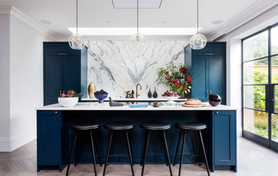
The owner initially envisaged a white kitchen, but as the project progressed and her bedroom was painted in a deep blue shade (see below), she adopted the hue for the bespoke cabinetry in here, too.
“If it were white, the Shaker units would look very traditional,” Matt says, “but by giving them a dark colour, it adds a contemporary edge.”
The worktop is a practical quartz. “It’s robust and has an attractive light veining,” Matt says.
“If it were white, the Shaker units would look very traditional,” Matt says, “but by giving them a dark colour, it adds a contemporary edge.”
The worktop is a practical quartz. “It’s robust and has an attractive light veining,” Matt says.
The keen cook wanted high-level ovens, so she didn’t have to bend down to retrieve dishes. The doors slide away inside when they’re opened, which saves space in the cooking area.
Slide&Hide ovens, Neff.
Slide&Hide ovens, Neff.
Countertop open shelf units allow the owner to have her cups on display to add another splash of colour to the kitchen.
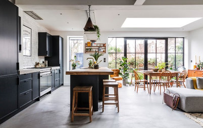
Digging out some of the garden at the back of the house made this floor accessible from outside and allows the dining area to flow out to the patio. The new space required structural steelwork, but this is concealed by the cabinetry, so it doesn’t intrude into the room.
The dining table and chairs are midcentury originals. “The owner likes the design and didn’t want the whole place to be traditional,” Matt says.
Pendant lights, Rothschild & Bickers.
The dining table and chairs are midcentury originals. “The owner likes the design and didn’t want the whole place to be traditional,” Matt says.
Pendant lights, Rothschild & Bickers.
An armchair is positioned just beyond the end of the run of kitchen cabinetry. The shade of the velvet upholstery picks up the kitchen’s colour, while its legs echo the wood of the midcentury sideboard alongside. The latter is a vintage find.
The original staircase was refurbished and monochrome tiles laid on the floor. The homeowner preferred not to have a runner, so the stairs were finished with paint instead.
“White steps would have shown wear and dirt more easily, so we painted them black,” Matt says.
“White steps would have shown wear and dirt more easily, so we painted them black,” Matt says.
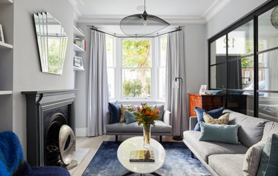
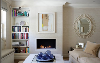
On the floor above the kitchen, the reception rooms have been furnished to create a chic cocktail/library room (to the left) and living space (to the right).
A group of chairs in front of the fireplace makes for a sociable arrangement.
Velvet tub chair; Le Cocktail velvet chairs, all Oliver Bonas.
Velvet tub chair; Le Cocktail velvet chairs, all Oliver Bonas.
The alcove shelving in the living room includes space for a television. However, with the homeowner not much of a TV watcher, space for reading was important, too, so a comfy armchair and footstool were tucked into the other alcove. “It’s a chill-out space if her kids are home and cooking downstairs,” Matt says.
The fireplace is original, but was sanded and given a lick of paint to smarten it up. It’s not in use, but a simple display of candles in the grate looks attractive.
The fireplace is original, but was sanded and given a lick of paint to smarten it up. It’s not in use, but a simple display of candles in the grate looks attractive.
The radiators throughout the home were replaced with cast-iron column versions. “The owner wanted period charm,” Matt says. “We kept as much of the original coving as possible, as well as the flooring, which was sanded back and refurbished. We did replace the windows, but it was like for like.”
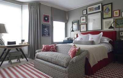
The master bedroom has a rich mix of styles, with contemporary dark blue walls, midcentury furnishings and traditional features.
“We often paint bedrooms in darker colours, as it makes the room cosy,” Matt says. The colour is balanced by the white ceiling, the lighter tones of the wood floor, and the wall of white wardrobes opposite the bed.
Walls painted in Carbon Blue, Fired Earth.
“We often paint bedrooms in darker colours, as it makes the room cosy,” Matt says. The colour is balanced by the white ceiling, the lighter tones of the wood floor, and the wall of white wardrobes opposite the bed.
Walls painted in Carbon Blue, Fired Earth.
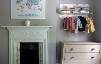
The bedside tables are vintage finds. The designers painted the frame to match the walls and give them a modern edge.
China bedside lamps echo the design of the bathroom basin (see below).
China bedside lamps echo the design of the bathroom basin (see below).
A wall of wardrobes was designed to fit the room and provide extensive storage. The cupboards include lots of hanging space at various heights plus drawers.
Find carpenters and joiners in your area.
Find carpenters and joiners in your area.
Even the skirting board area of the wardrobes was used – shoes fit tidily into sectioned drawers here.
The bathroom used to be a bedroom. Giving it up allowed the designers to create a bathing space next to the master bedroom on the first floor that acts as the en suite the room was lacking.
The look is traditional, with a freestanding bath, high-level cistern toilet, classic tiles, and a vintage vanity unit. A velvet chair adds to the luxury of the room.
Velvet tub chair, Oliver Bonas.
The look is traditional, with a freestanding bath, high-level cistern toilet, classic tiles, and a vintage vanity unit. A velvet chair adds to the luxury of the room.
Velvet tub chair, Oliver Bonas.
The shower has traditional fittings, and is encased in luxurious marble tiles. “The owner wanted a natural material, and liked the variation of the tiles,” Matt says.
The vanity unit already had a marble top, but the designers needed to refurbish the piece and drill holes to position the basin and tap.
Tell us…
What do you like about this smart Victorian house? Share your thoughts in the Comments section.
Tell us…
What do you like about this smart Victorian house? Share your thoughts in the Comments section.

Sponsored

Sponsored
Who lives here? A single professional
Location Victoria Park, east London
Property A Victorian terraced house
Size Four bedrooms and two bathrooms
Designers Matt Simpson and Louise McGarry of Pineapple Property
Photos by Tony Murray
The Victorian house had been refurbished in the past, but the work had left it with a small kitchen, and the upstairs layout didn’t work, either. Radical action to remedy the problems wasn’t out of the question, however. “The owner was willing to sacrifice bedrooms to have a good kitchen and bathroom,” designer Matt Simpson says.
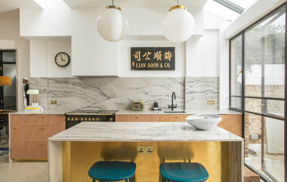
A new, larger kitchen was created on the lower ground floor, and room for dining was included, too. The kitchen has extensive storage, with even the understairs area boosting the total. As many appliances as possible have been integrated, including the fridge and freezer.
Cabinetry painted in Carbon Blue, Fired Earth.