Houzz Tours
Kitchen Tours
London Kitchen
Kitchen Tour: A Clever New Layout That Maximised Existing Space
Removing walls and rejigging rooms gave the owners of this house a light, liveable, spacious home
Most of us would like more rooms in our homes, so having one that’s more or less unusable seems a bit wasteful. That was the case in this 1980s house, which had several smaller rooms at the back that made it dark and cramped and left a good-sized, 4m x 4m area being used as a corridor.
With their children no longer at home, the owners decided it was time to make more of the space they had, so they searched for pros in their local area on Houzz and found designer Mia Spencer of House by Mia. She made the home feel bigger and brighter by cleverly reworking the layout and taking some inspiration from the masters of simplicity.
With their children no longer at home, the owners decided it was time to make more of the space they had, so they searched for pros in their local area on Houzz and found designer Mia Spencer of House by Mia. She made the home feel bigger and brighter by cleverly reworking the layout and taking some inspiration from the masters of simplicity.
Mia’s first task was to make the layout work harder within the original footprint, and that meant removing walls. In this ‘before’ photo, the wall behind the oven separated the kitchen from a 4m x 4m space that served as a corridor between the living room and the conservatory, which you can just see out of the window.
“The dining table was in the conservatory, so the space behind the kitchen had become almost a hallway – it was just a through room,” Mia says. “It’s not an enormous house, so to lose the use of a 4m sq space was a real shame.”
“The dining table was in the conservatory, so the space behind the kitchen had become almost a hallway – it was just a through room,” Mia says. “It’s not an enormous house, so to lose the use of a 4m sq space was a real shame.”
With the wall removed, light floods all the spaces and makes every inch usable.
At the other end of the kitchen, Mia took down a wall that sectioned off a small utility space, seen here, and stole an area of the underused garage to widen the kitchen and for a new utility room.
“The garage had ended up as a bit of a dumping ground; it had tired exercise equipment and the kids’ old stuff in there,” Mia says. “So we took 1.9m x 3m, and fitted in a washing machine, a tumble dryer and a cupboard – plus a hanging rail so clothes can be hung up straight away – then a second fridge-freezer and more storage on the other side.”
“The garage had ended up as a bit of a dumping ground; it had tired exercise equipment and the kids’ old stuff in there,” Mia says. “So we took 1.9m x 3m, and fitted in a washing machine, a tumble dryer and a cupboard – plus a hanging rail so clothes can be hung up straight away – then a second fridge-freezer and more storage on the other side.”
Freeing up the side wall where the utility area was made room for a full bank of units. As the couple wanted clutter-free worktops, Mia included a breakfast station on the right of the ovens. “It means the kettle, coffee machine and toaster can all be tucked away and are hidden from view when you walk into the room,” she says.
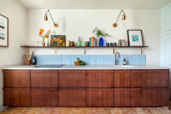
The wooden handles on the breakfast cupboard and fridge-freezer add interest to the bank of units. “When you have a neutral space with no bold colour, the details need to be special so the scheme doesn’t feel too flat,” Mia says. “We used handmade oak handles on the bank of cabinets and a really beautiful Japanese tile for the splashback [see the next photo]. These details really help to elevate the design.”
The slim Japanese tiles create a splashback on both sides of the kitchen. “I didn’t want to do something that would feel too clinical, because that’s the problem when you do clean lines – it can feel quite cold if you’re not careful,” Mia says. “[With the splashback,] I wanted to do something that would feel organic, and these tiles are all handmade and a little bit different; they have a speckled aspect to them. A sleek splashback would have flattened the whole thing.”
Tiles, Raven.
Tiles, Raven.
To further avoid a stark look, Mia steered clear of pure white in the space. The units are a very pale camel colour, while the walls are painted in a very warm grey. “It almost has a bit of pink in it, which worked really well with the colour of the cabinets – close but not matching, so you still get a little bit of definition,” Mia explains.
Kitchen, Howdens; painted in Cashmere. Walls painted in Rubine Ashes, Little Greene.
Kitchen, Howdens; painted in Cashmere. Walls painted in Rubine Ashes, Little Greene.
Having used luxury vinyl tiles for the wood-effect flooring in the living room, dining area and conservatory and experienced how hardwearing they are, the owners were keen to lay LVT in the kitchen, too.
They chose a pale grey tile-effect design. “The darker flooring wouldn’t have worked in the kitchen, so we did a tile version of the LVT that complements the worktops.” Mia says.
The work surface is engineered stone. “It has the warmth of concrete with the practicality of quartz,” she says. To avoid interrupting the sightlines in the new space, Mia chose a hob with an integrated extractor.
Worktop, CRL Quartz.
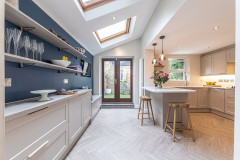
Open shelving, seen here on the right, makes the most of the shallow space behind the stairs. Mia stole a little space from the utility room behind to create the deeper-set area on the left.
Tempted to revamp your kitchen? Find local kitchen designers and read reviews of their work on Houzz.
Tempted to revamp your kitchen? Find local kitchen designers and read reviews of their work on Houzz.
The conservatory had previously been used as a dining area, but it tended to be hot in summer and cold in winter. To help regulate the temperature and turn it into a more usable space, Mia suggested replacing the glazed roof. “We put on a solid roof, but added skylights, so you still keep lots of light, but the temperature is now balanced,” she says.
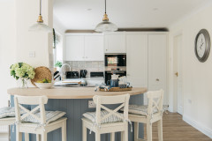
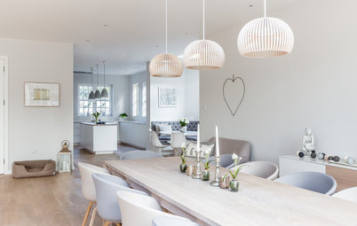
The dining table has been moved into the once-wasted space next to the kitchen. “The owners’ table didn’t fit, so we found this oval one that you can walk around. Because it’s a through space [as well as a dining one], it needed to function in both ways,” Mia says. “We did quite a lot of mapping out of the size of the table to work out whether there was going to be enough space to walk around it comfortably.”
Moving the table has freed up the conservatory. “There’s a really nice connection to the garden in there, so that’s become a coffee and chat space, or somewhere the owners can sit and read,” Mia says. “Now, all the spaces are being used.”
Jenson dining table, Made. Chairs, Cult Furniture.
Decorative details bring in colour and interest, not least the three striking artworks. “The owners chose all the art,” Mia says. “They said, ‘Because of working with you, we felt much more confident doing things like selecting art.’ They had a better understanding of how to dress the space.”
The pendant and wall lights chime with the gold touches in the art and accessories while keeping to the simple theme.
IC lights, Flos.
The pendant and wall lights chime with the gold touches in the art and accessories while keeping to the simple theme.
IC lights, Flos.
The living room also benefits from the extra light. There were tall bookcases in here previously, but they were a little overpowering, so Mia suggested this neat wall of built-in joinery.
The original floorplan shows the much smaller kitchen, top centre, with the utility room to the right and part of the garage butting into the space. The wall on the left of the kitchen separated it from what is now the dining area.
The current floorplan shows how Mia stole space from the underused garage to widen the kitchen and create a good-sized utility room. It also illustrates how removing the walls between the kitchen and the old utility and dining area have made a much more usable space.
The project wasn’t without its challenges. “The back wall wasn’t as insulated as we’d expected it to be, so it required some work,” Mia recalls. “And the induction hob with its own extractor is quite power-intensive, so we needed to upgrade the outside main fuse, which hadn’t been changed since the house had been built and was at its maximum.”
But the great relationship between the designer and the homeowners meant problems were smoothly resolved. “It’s an emotional connection with a designer,” Mia says. “You have to pick someone you like, because you need to be quite honest with them. You spend a lot of time in one another’s company.”
Tell us…
What do you think of this light, opened-up kitchen-diner? Share your thoughts in the Comments.



Who lives here? A professional couple whose children have left home
Location Bromley, south-east London
Property A 1980s detached house with three bedrooms
Dimensions Kitchen, 5m x 3m; dining area, 4m x 4m
Designer Mia Spencer of House by Mia
Photos by Nina Syruckova
The owners’ brief was simple: they wanted a light, open kitchen-diner that was connected to both the living room and the conservatory. They were also keen to have more storage.
Mia’s solution was to open up the space and install a clean-lined kitchen. “Everything was feeling very dark,” she says. “The ceilings are quite low, there aren’t really any architectural features we could make the most of, so it felt like modern was the way to go. The places to be inspired for that are Japan and the Nordic countries – they’ve done this clean-lined stuff for so long, they really are the masters of it.”