Houzz Tours
Kitchen Tours
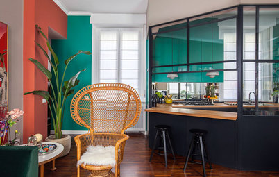
Kitchen Tour: A Midcentury Modern-style Space Full of Personality
A desire to celebrate materials and craftsmanship has given this kitchen bags of character

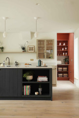
This California, USA, couple had a keen interest in design and had a wonderful time during their kitchen renovation. “They didn’t want a run-of-the-mill modern kitchen,” architectural designer and design-build firm owner Kevin Mond says. Instead, they wanted something that would showcase the qualities of the materials they used and the way things were crafted. This approach, common in midcentury modern design, helped infuse the space with their personalities and a sense of playfulness.
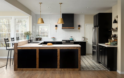
The focal point is the range wall. The splashback is a handmade blue brick veneer. The irregularity in the tiles and grout lines highlights that it was handmade, which was important to the homeowners. “In most cases, we’d freak out if grout didn’t look perfect, but these homeowners wouldn’t have it any other way,” Kevin says.
Other things they wanted to reveal were china, glasses and cookware. The open upper storage is composed of simple, 30cm-deep plywood boxes that match the cabinetry. Rather than having fancy features such as mitred edges, these are simple. “Their construction shows that a box is just a box,” Kevin says.
Vintage blue brick splashback in gloss, Fireclay Tile.
This detail illustrates the design philosophy of revealing materials and how things were crafted. “Both [owners] were very interested in showing materials for what they were. Their attitude was, ‘Let’s be proud that we are using plywood,’” Kevin says. So rather than covering the cabinet frames, where the pressed sheets that make up a piece of plywood show, he revealed them.
“We used a high-grade Baltic birch plywood so it wouldn’t have the gaps that lesser-quality plywood has,” Kevin says. “Usually, the cabinet frame would be hidden by a built-up counter edge, but we didn’t do that. The true thickness of the slab shows.”
The worktops are black granite. They have a honed finish to show off the qualities of the material. “This took out any sheen,” Kevin says.
Premium black granite worktops, MSI.
Kevin used inset doors and drawers to reveal the rest of the plywood cabinet framing. Typically, overlay doors and drawers would extend over the framing to cover it. “This shows that the cabinets are basically boxes within boxes,” Kevin says.
The framing also shows off the pressed composition of the plywood. More deep plywood boxes on the wall match those on the other side of the room.
On this side of the kitchen, they opted to use a simple upstand in the same granite. “We wanted to put the focus on the blue range wall,” Kevin says. “We didn’t want this side of the kitchen to take away attention from that.”
Interested in giving your kitchen a personal twist? Find reviewed kitchen designers in your area.
“These clients love to entertain,” Kevin says. The peninsula that faces the dining room provides a convenient spot for guests to gather and for the homeowners to set up a bar and serve food.
Another way Kevin revealed the construction and materials was by leaving the breakfast bar’s support brackets exposed. “These are really nice heavy pieces of metal,” he says. “Usually, you’d hide them inside the cabinetry, but we decided to show them off.”
The idea of nice, hefty pieces of metal also informed the use of oversized black metal cabinet handles. A coordinating matt black tap with a simple silhouette, meanwhile, works well with the granite worktops.
“Usually, a kitchen just dies at a wall where the next room begins,” Kevin says. Here, he blurred the line between the kitchen and dining room by wrapping the wall between them in more plywood built-ins. The shelves provide a nice spot to display some favourite decorative objects.
The homeowners also liked the idea of letting their cookware show. These drawer fronts allow the pans to be seen when closed. “At first, we also talked about having all of the cabinetry be finger-pull, but it turns out that was more expensive than using hardware,” Kevin says. “This was an opportunity to give them some cabinetry that could be opened this way.”
In the spirit of making the most of every inch, Kevin outfitted the corner cabinet with pullout shelving.
In the spirit of making the most of every inch, Kevin outfitted the corner cabinet with pullout shelving.
Kevin concentrated a wall of hardworking cabinets around the fridge. The cabinet to the right is for brooms, mops and cleaning supplies. The cabinets to the left are pantry storage. The upper cabinets are for seasonal, bulk and other lesser-used items.
“Most people just want the construction to be over, but these homeowners would have been happy to have it go on forever,” Kevin says. “They loved everything about the design process.”
Tell us…
What do you like about this kitchen? Share your thoughts in the Comments.
“Most people just want the construction to be over, but these homeowners would have been happy to have it go on forever,” Kevin says. “They loved everything about the design process.”
Tell us…
What do you like about this kitchen? Share your thoughts in the Comments.


Sponsored

Sponsored
Who lives here? A couple
Location Berkeley, California, USA
Size 200 sq ft (19 sq m)
Designer A collaboration between the homeowners and Kevin Mond of HDR Remodeling
Photos by Michael Hospelt
“Because this house is only about 900 sq ft, we had to make every inch count,” Kevin says. The owners wanted to be able to work in the kitchen together and entertain with ease. To accommodate this in the 200 sq ft space, Kevin designed a double-L layout, meaning the room has two peninsulas in opposite corners.
The peninsula towards the back of the kitchen provides prep space and makes it easy to set down food from the fridge and pantry in a spot that’s convenient to the range and sink. The peninsula in the foreground serves the dining room.