Houzz Tours

Room Tours
London Room Tour
Room Tour: A Victorian House Gets a Neighbour-friendly Extension
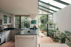
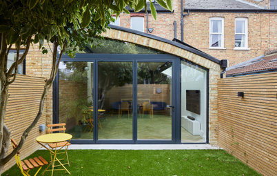
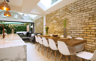
An angled roof creates dramatic lines in this unusual extension to a Victorian terraced house

The typical Victorian terraced house is a two-up, two-down construction that, at some point, has had a kitchen added on the rear. This house in east London was no exception. “The kitchen was small and very cut off from the rear dining room. Everything felt very closed in on itself,” says architect Tom Kaneko. “The owners wanted a lighter, airier feel and to be able to appreciate the garden.”
Rather than add a standard, boxy extension at the back, though, Kaneko designed a thrilling, angled space. Not only does it open out the rear of this house, it’s a neighbour-friendly design, too.
Rather than add a standard, boxy extension at the back, though, Kaneko designed a thrilling, angled space. Not only does it open out the rear of this house, it’s a neighbour-friendly design, too.
This before shot shows the cramped kitchen to the rear and the unused space of the side return.
A complicating factor of this build was the site’s awkward shape, which gets narrower as it heads towards the garden. “With a pitched roof and a tapered site, it was quite tricky,” says Kaneko. He made every detail in 3D first to get it right. “Flat roofs are so much easier, especially on an awkward site like this one and with so much of the structure exposed. It was a design challenge!”
Kaneko looked into fitting the large steel seen here within the roof, but it wasn’t feasible. “There are so many funny lines going on here,” he laughs. “There isn’t a single right angle in this project. That’s not something you get very often. It’s because the house is on a bend in the road.” Using a post support here would have been an alternative to the exposed roof steel, but the owners wanted a clear view through to the garden.
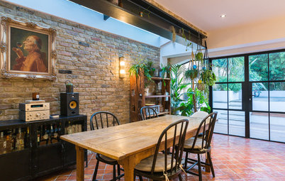
In terms of aesthetics for the extension, the owners were keen to incorporate lots of wood and carpentry. Interior designer Pippa Murray then suggested the scheme be dark, as a nice contrast to all the natural materials. “The owners went for it!” she says. Now, the colours change beautifully, looking bold by day and cosy at night.
“There’s a lot of glazing,” says Murray. “I like the idea of the glass disappearing at night.” Mood lighting is integrated in the panelled wall and shelving to create a soft, ambient glow.
Plastered walls (left-hand side) painted in Hague Blue, Farrow & Ball.
Kaneko looked into fitting the large steel seen here within the roof, but it wasn’t feasible. “There are so many funny lines going on here,” he laughs. “There isn’t a single right angle in this project. That’s not something you get very often. It’s because the house is on a bend in the road.” Using a post support here would have been an alternative to the exposed roof steel, but the owners wanted a clear view through to the garden.
In terms of aesthetics for the extension, the owners were keen to incorporate lots of wood and carpentry. Interior designer Pippa Murray then suggested the scheme be dark, as a nice contrast to all the natural materials. “The owners went for it!” she says. Now, the colours change beautifully, looking bold by day and cosy at night.
“There’s a lot of glazing,” says Murray. “I like the idea of the glass disappearing at night.” Mood lighting is integrated in the panelled wall and shelving to create a soft, ambient glow.
Plastered walls (left-hand side) painted in Hague Blue, Farrow & Ball.
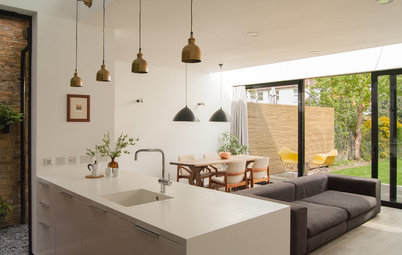
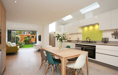
The owners love to cook, so the kitchen is placed centrally in the extension. “They liked the idea of the kitchen in the middle,” says Kaneko. “To them, that’s the spot around which all life revolves, so it made sense to have it there.”
Due to the pitched roof, the internal height at the lowest point of the eaves is actually lower than typical head height. “This was another restriction, so we fitted units along that external wall where head height isn’t an issue,” Kaneko explains.
The cabinets are made of oak veneer fronts dyed black. “The wood has an open grain, which you can see even when it’s treated with a black stain,” says Murray. As a contrast, the worktop is polished granite.
Kitchen made by Peter Martin to Pippa Murray’s design.
The pitched roof and walls are clad in pine that’s been dyed black. “The aim was to frame the view,” says Kaneko. A clever cantilevered shelf system runs the length of this wall and shelves can simply be slotted into it. “We added a few posh bits, such as the knife block, but the rest is just simple oak boards in different sizes,” says Kaneko. “You can move them or add more shelves if you like.”
A great deal of storage is fitted on the full-height wall opposite the U-shaped arrangement of units. There are two larders to the left of the coffee station, three drawers below and a fridge-freezer and cupboards to the right. “All of the lines in this space point towards the garden,” says Murray. “Everything from the timber panelling to the horizontal wood grain on the kitchen units.”
10 brilliant ways to use wasted space in the kitchen
10 brilliant ways to use wasted space in the kitchen
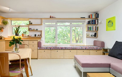
At the very rear of the extension, overlooking the garden, there’s a Japanese-inspired seating area.
“The owners mentioned [furniture designer and a father of the American craft movement] George Nakashima as a style reference – and he happens to be my design hero!” says Murray. “I designed the sofas as two-pieces, and they were handmade from native elm by Alex White in Clapton [east London] from four massive slabs joined in a simple, Japanese-inspired construction. The cushions were specially made by Jess Tiller.”
Offcuts of the elm were used to create the two stools at the breakfast bar (see the first photo).
In the seating area, the nifty, versatile shelving system is used to create a display of houseplants, which stand out beautifully against the dark background. The bottom slab of elm on this sofa section is extra long to create a coffee table (visible in the previous photo).
10 insider tricks to help you style your home like a pro
10 insider tricks to help you style your home like a pro
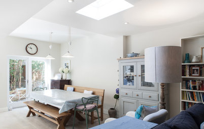
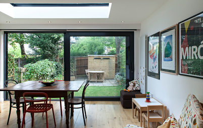
Previously, the dining room had access to the side return via French windows, as this before shot shows. Now, it flows onto the spacious extension.
“It was quite a dark space, and if we’d carried the black and blue colours into here, it would have felt a bit closed in,” says Murray. “So we used white as a contrast and to bring the light levels right up.”
“It was quite a dark space, and if we’d carried the black and blue colours into here, it would have felt a bit closed in,” says Murray. “So we used white as a contrast and to bring the light levels right up.”
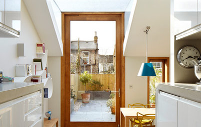
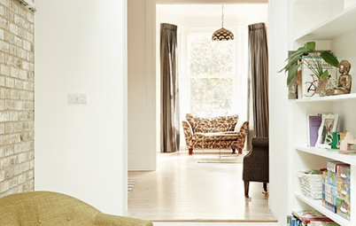
Building regulations stipulated that the hall and kitchen had to be separate, to meet fire safety rules. Kaneko fitted a door at a slant, to allow for a wider design. If it had been set level with the shelving, it would be a very small opening. “This original route through the house is really narrow, as in so many Victorian terraced homes,” he says.
A glass inset in the door to the hallway allows light to flow through. “It was an easy thing to do, but it means that when you open the front door, you can see right through to the garden. All the sight lines are there,” says Kaneko. “The main circulation route through the ground floor is along this side, all the way down to the garden.”
Bespoke built-in shelving and storage provides space to display finds and store stuff out of sight. An oak trim brings definition to the unit.
Bespoke bookcase, Peter Martin.
Bespoke bookcase, Peter Martin.
In addition to designing the kitchen extension, Kaneko worked on the loft. The house already had a converted loft, but he extended this to the rear. “I tried to find the most sensitive way to do it,” he says. “Building a little dog-leg extension like this is never the most attractive thing, but it gained the owners a really good shower room.”
He replaced the existing red tiles with dark slate, using them on the loft and the extension roof below. “I just tried to keep it as discreet as possible,” he says.
Wowed by this exciting extension? Share your thoughts in the Comments below.
He replaced the existing red tiles with dark slate, using them on the loft and the extension roof below. “I just tried to keep it as discreet as possible,” he says.
Wowed by this exciting extension? Share your thoughts in the Comments below.

Sponsored

Sponsored
Who lives here A young couple and their baby
Location Wanstead, east London
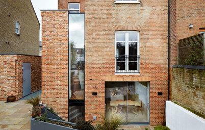
Property A Victorian terraced house over three floors
Size The space is 10m x 4.2m; the extended part is 5.7m long; part of a terrace house with 4 bedrooms and 2 bathrooms
Architect Tom Kaneko of Tom Kaneko
Interior Designer Pippa Murray of Pippa Murray Design
Photos by Bruce Hemming
This extension’s slanting roof design is a canny solution to a handful of issues. “People want plenty of light and space in their extension,” says architect Tom Kaneko, “but that comes at the expense of having a massive wall for the neighbours to look at.”
Kaneko’s solution is the best of both worlds. “By having lower eaves on the boundary wall and a pitched roof, you have that feeling of space inside, but to your neighbours, the extension is only about 2.1m high,” he says.
In addition, the pitched roof looks a lot less harsh than a flat-roofed extension. “The original idea was to be neighbourly while also achieving more space, but it looks quite gentle, too, so there are other bonuses,” he says.
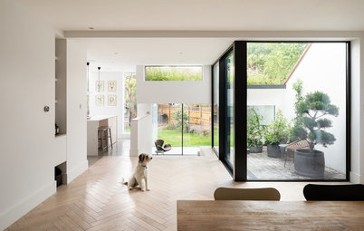
Oak chevron flooring, Wood & Beyond.