Houzz Tours

Kitchen Tours
Kitchen Tour: A New Extension Creates Space for a Large Family
Dingy garden space was put to good use in this ‘infill’ extension in Bristol, as these before and after photos show

Simon Heckford’s clients had lived in their house for around 20 years when they got in touch, wanting to create a generous family space at the back of the property. The kitchen had already been extended, but on a much smaller scale.
“It wasn’t full-width and purely housed the kitchen,” Simon says. “There was no real connection to the dining room, so the brief was to create a light, airy space for a kitchen-diner and a relaxed seating area that opened onto the garden.”
“It wasn’t full-width and purely housed the kitchen,” Simon says. “There was no real connection to the dining room, so the brief was to create a light, airy space for a kitchen-diner and a relaxed seating area that opened onto the garden.”
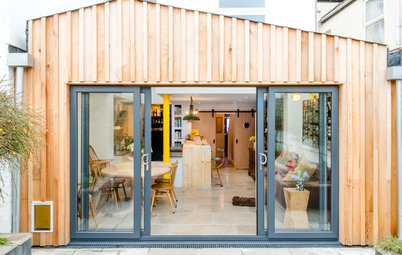
Here’s the back of the house after the project was completed.
The position of the arched window led to Simon designing two rooflines within the new extension: one a mono pitched roof and the other flat. “The roofline was responding to adding as much ceiling height as possible while not obscuring the arched window on the half landing,” he explains.
There are bifolding aluminium doors in anthracite on the main section; the roof here protrudes beyond the doors to give a bit of shelter. “As long as it’s not wind-driven rain coming in, you can still have the doors open even when it’s wet,” Simon explains.
On the right-hand section, there are French windows.
This ‘before’ photo shows the original extension.
Find an architect or building designer in your area in the Houzz Professionals Directory.
Find an architect or building designer in your area in the Houzz Professionals Directory.
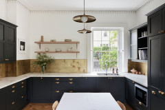
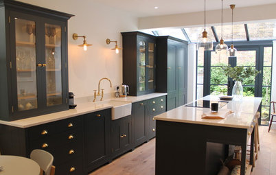
A kitchen company was responsible for the finer details of its design, but Simon did the basic kitchen plans, laying it out to run along the side wall and putting in the peninsula unit containing a sink. The worktops are granite.
This is the location of the original kitchen, so all the services were already in place. “We’re not always guided by this, although in this situation it did make sense to keep the kitchen here,” Simon says. “But it was more about siting the dining table where it would get as much light as possible, and for the extractor to be on an exterior wall.”
There’s also a new utility room behind the kitchen (to the left of the units).
Shaker Ermine kitchen units in matt Pebble, Wren Kitchens. Worktops, Avon Marble.
The smaller, old extension as seen from inside the original kitchen.
This plan of the ground floor shows how Simon has arranged the new space and how it connects with the old. The challenge he had was that the garden protrudes from the back of the house at an angle, which you can see clearly here.
The new extension is northeast-facing, so it’s lovely and light, but never too hot or bright,” Simon says. “It’s nice to design this sort of orientation, as it can never have too many windows.”
Along with the two sets of doors, Simon added more glazing at different angles to boost natural light in the space. There are three windows in the wall section going up to the pitched roof and three skylights in the flat roof, all seen here.
Glass, Glazing Vision. Doors, sourced by client.
Along with the two sets of doors, Simon added more glazing at different angles to boost natural light in the space. There are three windows in the wall section going up to the pitched roof and three skylights in the flat roof, all seen here.
Glass, Glazing Vision. Doors, sourced by client.
“The layout allows you to maintain circulation space around the dining table, rather than it being where the sofa is. This way optimises the space,” Simon says.
The family has two reception rooms at the front of the house, so they didn’t need the extension to include a full living area. “They just wanted it to be a generous family space,” Simon says.
Walls painted in Clock Face, Dulux.
The family has two reception rooms at the front of the house, so they didn’t need the extension to include a full living area. “They just wanted it to be a generous family space,” Simon says.
Walls painted in Clock Face, Dulux.
Looking at the room from the garden, the wood door on the right leads to the hall, while the glazed doors on the left lead to what is now the owner’s office and treatment room (she’s a practitioner of several alternative therapies).
These doors had previously been a smaller window that led directly onto the garden. (It can be seen in the very first ‘before’ photo of the exterior.) Simon’s design had this replaced with the doors to connect the old and new spaces.
These doors had previously been a smaller window that led directly onto the garden. (It can be seen in the very first ‘before’ photo of the exterior.) Simon’s design had this replaced with the doors to connect the old and new spaces.
The original window was a little higher than the extension’s roof. As such, Simon designed in a clever rooflight, which allows for the height of the original window to be retained and also brings maximum light into the owner’s office.
Dining table; dresser; side table, clients’ own. Armchair, Ikea. Clock, La Redoute.
Dining table; dresser; side table, clients’ own. Armchair, Ikea. Clock, La Redoute.
Reclaimed solid pine flooring echoes the flooring in the rest of the house.
Reclaimed floorboards, Wessex Reclamation and Rose Green Tiles & Reclamation.
Reclaimed floorboards, Wessex Reclamation and Rose Green Tiles & Reclamation.
“The extension doesn’t encroach too much on the garden, which is unusual for this type of project,” Simon says.
The existing kitchen indicates the size of the original extension. “So there was already a dog leg coming out,” Simon explains. “We infilled here, rather than building out further. It was always quite a dark and dingy external space, so adding the big glazed windows and bifolds made good use of the area.”
The existing kitchen indicates the size of the original extension. “So there was already a dog leg coming out,” Simon explains. “We infilled here, rather than building out further. It was always quite a dark and dingy external space, so adding the big glazed windows and bifolds made good use of the area.”
Aside from the pendant lights over the peninsula, there are downlights dotted about to supply an even spread of light and allow the homeowners to change the positions of furniture easily.
Linc sofa in graphite, Harveys.
Linc sofa in graphite, Harveys.
The rooflight by the internal French windows goes up by around 500mm to 600mm, which raises it a touch above the roofline.
The plans for the glazing, drawn to show the roof from above.
What is now a good-sized utility room used to be a cramped dining area, connected to the original kitchen by a step. Excavating to remove the step and even up the floor levels “took a couple of thousand” from the budget, but it was a priority for the owners.
As well as the usual laundry paraphernalia, there’s a microwave and toaster in here. “It’s an occasional-use extension to the kitchen for the bits you don’t necessarily want in sight,” Simon explains.
You can also just see the mantelpiece belonging to an original fireplace on the right. The pine door is also original, and leads to the cellar. The vent seen close the ceiling is to boost cellar ventilation rather than for the utility room. “It’s already a big room with lots of air circulating,” Simon says.
Tell us…
What do you like about this light-flooded family extension? Let us know your thoughts in the Comments.
What do you like about this light-flooded family extension? Let us know your thoughts in the Comments.


Sponsored
Who lives here? A couple with four children at secondary school and university
Location Bishopston, Bristol
Property A two-storey Victorian, double bay fronted mid-terrace, with four bedrooms and two bathrooms
Kitchen-diner dimensions 8.5m wide x 4m at the deepest point (it’s not quite at right angles to the house)
Designer Simon Heckford of Oasys Property Solutions
Budget Around £100,000
Photos by Faye Hedges
There was one particular design challenge for Simon when he drew up the plans for an extension to this Victorian terraced house.
“There’s an arched window [seen here in the centre] that illuminated the stairwell and which – quite rightfully – they wanted to retain,” he explains. The window led Simon to create an unusual roofline for the new extension.