
Kitchen Tour: A Cluttered Kitchen Gains Order, Space and Light
Check out before and after photos to see how this dated, dark, L-shaped room became fresh, modern – and highly efficient

When Simon Lennox of Adornas Kitchens first met the couple who own this kitchen in his showroom, they weren’t really sure what they wanted. “Then they returned a few months later, having done lots of research,” he says. “She had an iPad open on Houzz, where she’d saved loads of photos of kitchens she liked.”
When Simon did a site visit, he saw that the kitchen had “more cupboards than they knew what to do with. However,” he says, “lots of the kitchens they liked didn’t have any wall cabinets, so we had to design something to achieve that look but not compromise on storage.” Read on to see how Simon rose to the challenge.
This article is from our Most Popular stories file
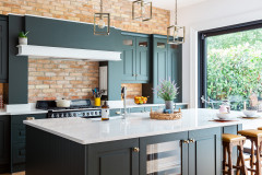
“Originally, it was a very dark room,” Simon says.
There were also “loads of wall cupboards”.
As well as wanting clearer walls and a brighter room, the couple also asked for a more open-plan space. Previously, it had felt claustrophobic, with the corner door opening directly onto banks of units either side.
“It felt very tight due to the diagonal angle of the wall,” Simon says. “I wanted to totally open up that space, so we restricted most of the cabinets to the back wall.”
Find kitchen designers and fitters in your area.
“It felt very tight due to the diagonal angle of the wall,” Simon says. “I wanted to totally open up that space, so we restricted most of the cabinets to the back wall.”
Find kitchen designers and fitters in your area.
The base units on the perimeter have slab doors in pale grey with a matt finish. In a nod to industrial style, they have black knurled bar handles.
Slab units in Light Grey, Adornas.
Slab units in Light Grey, Adornas.
“In the absence of wall cabinets, drawers are the future,” Simon says. “They provide much more storage than a cupboard. With drawers being telescopic, you can see everything at the back – nothing gets lost, nothing is inaccessible.”
Plates and bowls are among the items – all meticulously planned-for – that live in the drawers. There’s also a dedicated cutlery drawer and one for utensils, another for storage containers, and others for crockery, pots and pans.
“No food lives here,” Simon explains. “It’s not part of that zone. Stuff that lives here is connected to the hob or what comes out of the dishwasher to make the layout as efficient as possible.”
“No food lives here,” Simon explains. “It’s not part of that zone. Stuff that lives here is connected to the hob or what comes out of the dishwasher to make the layout as efficient as possible.”
The units under the window include space for the dishwasher. “This was the owners’ existing one,” he says. “They considered getting a new one, but the stainless steel works brilliantly as part of the industrial theme.”
As well as the base units, Simon incorporated a storage zone for food, seen on the right here.
As well as the base units, Simon incorporated a storage zone for food, seen on the right here.
“This is what we call an appliance wall. It’s alleviated the need for wall units,” Simon says. The tiled section was built out by Simon’s team to extend the existing wall beyond the beam, creating space for the new storage zone.
They constructed a bulkhead to integrate the units into the new wall, and gave it a tiled surround. “Otherwise you might have ended up with a big grey oppressive blob,” Simon says. “The tiles – which match those in the cooking zone – create a visual bridge between the kitchen and dining areas.”
They constructed a bulkhead to integrate the units into the new wall, and gave it a tiled surround. “Otherwise you might have ended up with a big grey oppressive blob,” Simon says. “The tiles – which match those in the cooking zone – create a visual bridge between the kitchen and dining areas.”
Behind the doors are a fridge-freezer and a full-height larder, as well as the ovens and a drawer below these for baking trays. “Just where you need them,” Simon says.
Classic Collection ovens, Smeg.
Classic Collection ovens, Smeg.
Again, the design is all about efficiency. “Shopping can all go on the island and then you can easily unload it all – fresh, frozen and long-life – into the food zone,” Simon says. “The whole kitchen is compartmentalised.”
Though the larder door looks like two doors from the outside, this is just a visual trick so it mirrors the fridge-freezer on the other side.
As part of the blend of traditional and modern, Simon suggested a completely different style of door and handle on this bank of units – what he describes as a smooth Shaker style with smaller knurled handles.
Appliance unit doors in Dust Grey, Adornas. Drawers, Blum.
Ask an expert: How can I plan the perfect kitchen storage?
The tiling on the splashback is the same as that on the appliance wall. “We wanted something with a rough, industrial, almost commercial look,” Simon says. “This is an irregular-surface tile, from Italy. We were after something different to a metro tile.”
They carried the tiles up to the ceiling, which makes the room feel taller. “Previously, there was space between the wall cabinet tops and the ceiling, so it lowered the height of the room visually,” Simon says.
Tiles, Ceramica Etc.
They carried the tiles up to the ceiling, which makes the room feel taller. “Previously, there was space between the wall cabinet tops and the ceiling, so it lowered the height of the room visually,” Simon says.
Tiles, Ceramica Etc.
The extractor is also incorporated within the tiled surface. “Part of our philosophy is that it shouldn’t be seen,” Simon explains. “We like to get the best-performing model that’s really practical and not worry about how it will look – hiding it instead. So this one, which is ducted to the outside, has a very high extraction rate.”
Tap; sink, both Caple.
Tap; sink, both Caple.
To add a little wall storage for the owners, Simon fitted heavy oak shelves that connect with the extractor hood, since there’s no change in depth.
As well as providing space for plants and recipe books, it was also an opportunity to include LED strips as task lighting. These would ordinarily go beneath wall cabinets, so the shelves solved that problem.
The gas hob is recessed, with only the buttons and rings above worktop level. “Just like in a commercial kitchen,” Simon says, “building on the thread that goes through the whole design.”
The slimline worktops are 20ml and are a concrete-effect quartz in Urban Grey.
Recessed gas hob, Caple.
The team also custom-made a portable island, which can double as a work station. “We always allow a metre clearance around an island,” Simon says. So there just wasn’t room to build a permanent structure in the centre of the room.
This mobile version, on castors, provides storage, seating and extra work space. Here, it’s being used as a breakfast bar, but it can also be rolled over to “dock” around the cabinets on the perimeter to boost the food prep area. It also provides storage for everyday plates, bowls and wine glasses. “We created the drawer to be just the right height for the tallest of the owners’ glasses,” Simon says.
The wooden top is full stave oak and matches the timber used for the shelving. “The wood really warms up the room,” Simon says.
Island in Graphite Grey, Adornas.
The uPVC windows were originally mahogany effect.
They are now painted graphite grey to match the island.
The floor is oak laminate. “That decision was born out of it already being in their hall,” Simon explains. “We wanted to extend that to get that consistency of surface and material.”
Laminate flooring in Oak, Egger.
The floor is oak laminate. “That decision was born out of it already being in their hall,” Simon explains. “We wanted to extend that to get that consistency of surface and material.”
Laminate flooring in Oak, Egger.
The dining area before work started.
Simon and his team also installed two new radiators – one brand-new one in the kitchen zone, and another in the dining area. Previously, there had just been one low radiator for the whole room, seen here on the right. “It was freezing!” Simon says.
Simon and his team also installed two new radiators – one brand-new one in the kitchen zone, and another in the dining area. Previously, there had just been one low radiator for the whole room, seen here on the right. “It was freezing!” Simon says.
The owners were nervous about the pink wall initially, but as the core part of the kitchen is neutral, this is less of a commitment and can be changed down the line. Luckily, though, Simon says, “They love it!”
Feature wall painted in Sulking Room Pink; other walls painted in Strong White, all Farrow & Ball.
Tell us…
What’s your favourite storage idea from this kitchen? Let us know in the Comments section.
Feature wall painted in Sulking Room Pink; other walls painted in Strong White, all Farrow & Ball.
Tell us…
What’s your favourite storage idea from this kitchen? Let us know in the Comments section.

Sponsored

Sponsored
Who lives here? A young professional couple expecting their first baby
Location Bangor, Northern Ireland
Property A detached two-storey, three-bedroom house that’s around 20 years old
Kitchen-diner dimensions An L-shaped space that’s approx 6.4m long and 4.5m wide.
Designer Simon Lennox of Adornas Kitchens & Interiors
Project cost £14,000
“We were actively involved in all of the choices in the kitchen,” Simon says. Stylewise, he wanted to do “a mashup of traditional and modern”. He was also keen to give the kitchen an industrial feel; to have elements in it that felt like something you’d see in a professional kitchen.
Photos by Collings & Heal Photographic Services